You should spend about 20 minutes on this task.

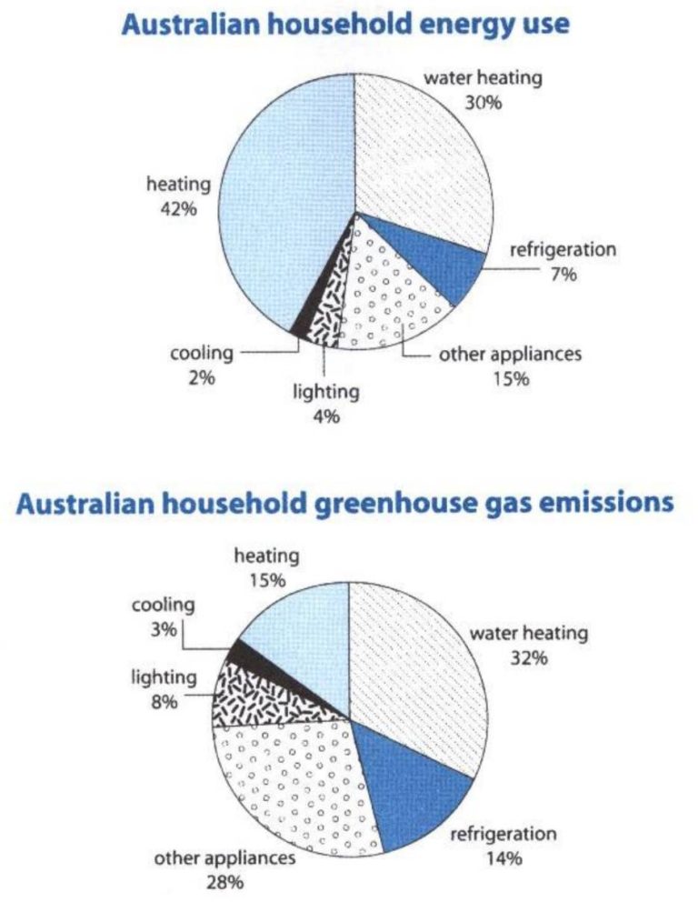
The first chart below shows how energy is used in an average Australian household. The second chart shows the greenhouse gas emissions which result from this energy use.

Summarize the information by selecting and reporting the main features, and make comparisons where relevant.

Write at least 150 words.

The first pie chart illustrates in which sectors an average Australian family uses energy, and the second pie chart shows to what extent these sectors contribute to releasing greenhouse gases.

Overall, heating is responsible for the most significant share of energy consumption, followed by water heating. However, the majority of emission is attributed to water heating.

In an Australian household, heating and water heating consume the highest amounts of energy, with the former using as much as 42% of the energy, whereas the share of the latter is lower by a margin of 12%. Refrigeration takes up 7% of energy in an Australian house, and a mere 6% is owing to lighting and cooling (4% and 2%, respectively). Other appliances account for only 15%, collectively.

Concerning gas emission, nearly a third of the greenhouse gas release is due to water heating, making it by far the most important contributor, while about half this figure is because of heating (15%). 14% of the emitted energy is caused by refrigeration. Also, the contribution of lighting and cooling is a mere 11%, and other appliances are responsible for the remaining 28% of the contamination.

Grade: 8