
You should spend about 20 minutes on this task.
The graph below shows the changing patterns of access to modern technology in homes in the UK (expressed in percentage terms).
Summarize the information by selecting and reporting the main features and make comparisons where relevant.
Write at least 150 words.
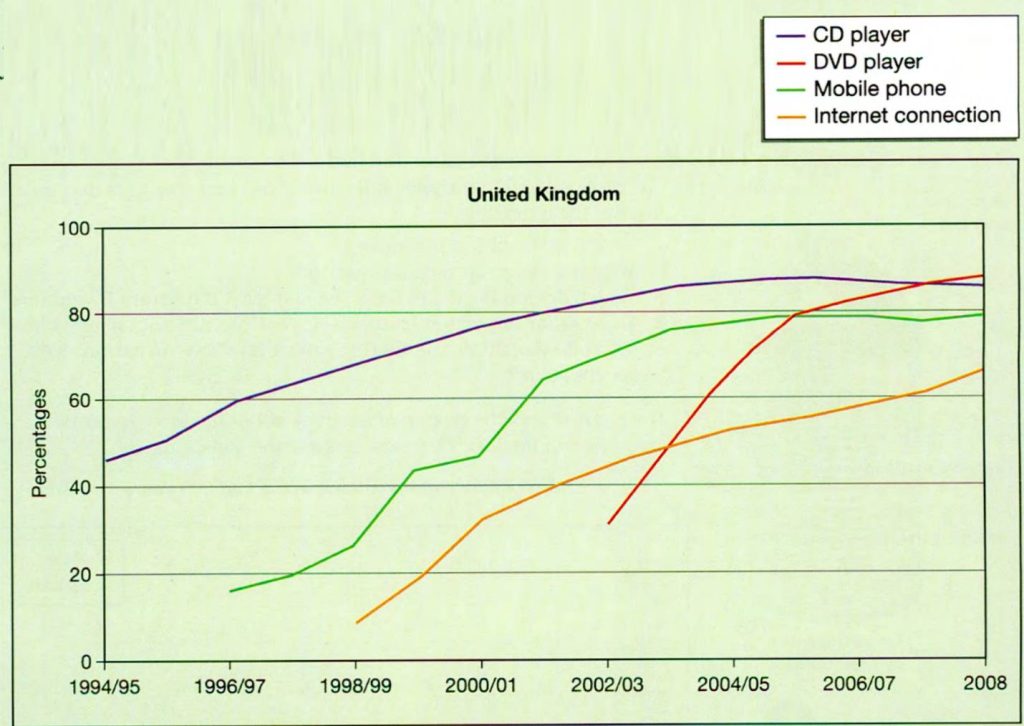
The graph shows the percentages of homes in the UK which had access to four items of modern technology between 1994/95 and 2008. For all of these four items, the percentage showed a clear upward trend.
In 1994/5, about 48 percent of homes had a CD player. This figure rose gradually over time to reach around 90 percent in 2004. There was little change in the percentage after that. The number of households with mobile phones stood at just under 20 percent in 1996. This also increased over the period and reached approximately 80 percent in 2004/6. After that, this figure also levelled off.
Turning to houses with Internet connections, the percentage rose from around 10 percent in 1998 to just over 60 percent in 2008. No figures are given for households with DVD players before 2002/3. The percentage rose steeply from around 30 percent at that time to about 80 percent in 2004/5. It then continued to increase, but more gradually. (162 words)
Grade: 8~9
Paragraph one paraphrases the topic and gives an overview of the general trends. Paragraph two gives details for CD players and mobile phones, as these two items showed similar trends. It quotes the percentages for the beginning of the period and the highest points. Paragraph three gives details of the remaining two items.