
You should spend about 20 minutes on this task.
The line graph below shows the number of people in Great Britain living alone by age from 1996 to 2012.
Summarize the information by selecting and reporting the main features, and make comparisons where relevant.
Write at least 150 words.
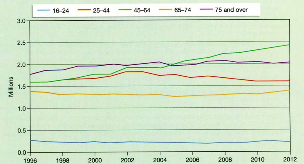
The line graph shows the number of people in the UK living on their own between 1996 and 2012. It is clear that for most age groups there was relatively little change over the period.
The group who were least likely to live alone were the 16-24 year olds. About one quarter of a million lived alone in 1996 and the figure remained largely unchanged. Among 25 to 44 year olds, about 1.6 million lived alone in 1996. There was a slight rise in the number between 2000 and 2004 but it had dropped again by 2012.
For the oldest age groups, those aged between 65 and 74 and those aged 75 or over, there was again little change. For the first group, the figure stood at around 1.4 million and for the second there was just a slight rise from about 1.8 to 2 million.
There was, however, a more significant change among 45 to 64 year olds. In this case, the figure was about 1.6 million in 1996, but rose to reach nearly 2.5 million in 2012. (187 words)
Grade: 8~9
Paragraph one paraphrases the rubric and gives an overview. Paragraph two gives details about the youngest two groups. Paragraph three gives details about the oldest two groups. Paragraph four gives details about the remaining group and points out that this group shows a different trend.