
You should spend about 20 minutes on this task.
The graph shows the life expectancy of people living in Asian regions from 1950 and predicts life expectancy until 2300.
Summarize the information by selecting and reporting the main features, and make comparisons where relevant.
Write at least 150 words.
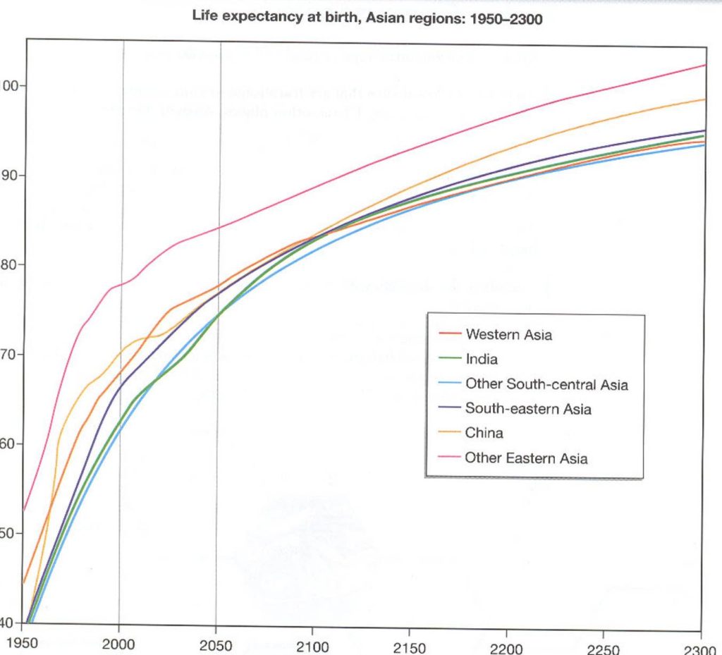
The line graph indicates the life expectancy of people living in Asian regions starting 1950 up until 2300. Most striking about the graph is trends are all upwards; in most areas of Asia life expectancy more than doubles from average of 40-50 years old in 1950 to expected 90-100 years old in 2300.
The initial rose was steep in each case, especially between 1950 and 2000, the trends have gradually slowed since 2000. They are set to continue rise but at a much slower rate.
The Eastern Asian region offers the longest life expectancy for all the periods shown. In 1950 it was higher than all the other regions at an approximate age of 54 years and it is predicted to peak at a likely 103 or 104 years by 2300.
South-central Asia generally has the lowest life expectancy throughout beginning under 40 years old and predicted to reach just under 90 years old. This trend is closely matched by India which follows almost exactly the same pattern, reaching a year or so higher than South-central Asia, except in the years between 2030 and 2050, where India set to be a year or so behind. (198 words)
Grade: 7
The vocabulary in the answer is strong with some good collocations and natural use of language. A summary is included at the beginning. All the key information is included though the amount of data given as evidence could be higher, especially at the start. There is a good range of grammar but some errors with the word forms and sentence structures.