You should spend about 20 minutes on this task.

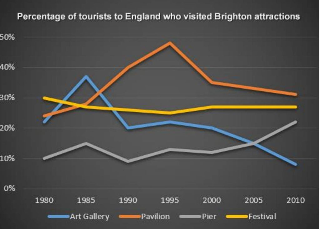
The line graph below shows the percentage of tourists to England who visited four different attractions in Brighton.

Summarize the information by selecting and reporting the main features, and make comparisons where relevant.

Write at least 150 words.

The line graph illustrates the proportion of people visiting four tourist attractions in Brighton between 1980 and 2010.

Overall, the share of tourists to the pavilion and the pier increased, while those for the art gallery and the festival experienced a fall over the period. Also, although the festival was initially the most popular place, it was overtaken by the pavilion at the end.

In 1980, the festival had the highest share of visitors at 30%, but the figure then decreased gradually to about 25% in 1995 and then enjoyed a minimal climb to 27% in 2000, following which the figure plateaued. The pavilion visitors, on the other hand, fluctuated wildly over the years. Initially accounting for 24% of the visitors, the figure rose dramatically to peak at just under 50% in 1995, after which it fell sharply to approximately 35% in 2000, and was followed by another decline, although less steeply at the end of period.

The percentage of art gallery visitors experienced fluctuations, rising to about 37% before returning to its original level (at around 20%) in 1990. After a slight rise, it fell steadily to maintain the lowest-visited place in 2010 (8%). Also, the figure for pier, after mild fluctuations between 1980 and 2000, grew remarkably and stood at nearly 22%.

Grade: 7.5