
You should spend about 20 minutes on this task.
The pie chart shows the number of people who were using different languages online. The table shows the average number of people online each year.
Summarize the information by selecting and reporting the main features, and make comparisons where relevant.
Write at least 150 words.
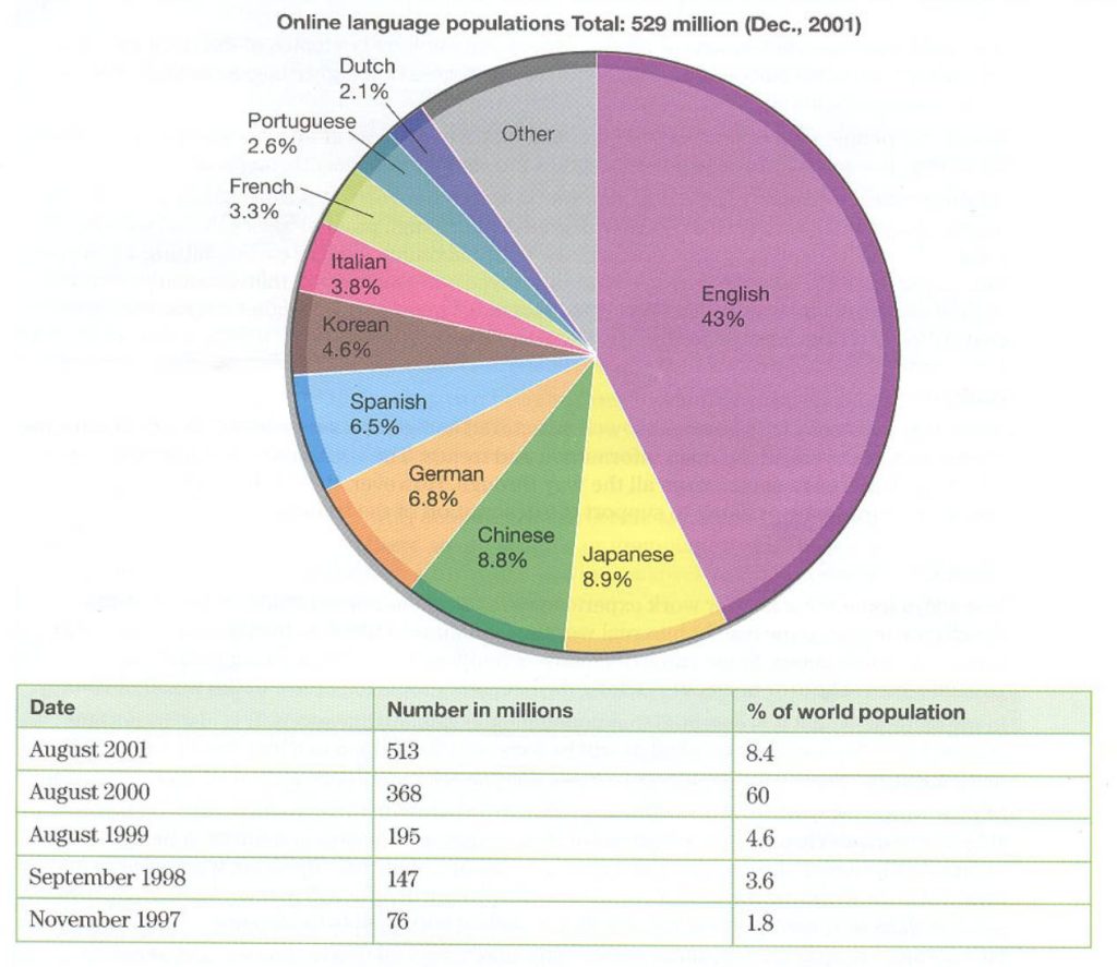
The pie chart provides a breakdown of the types of language used by those on the internet by the end of 2001 and the table offers information about the number of people using the net as a percentage of the world's population.
The percentage of the global population increased year on year for the given period, reaching its highest level in 2001. At this point 8.4 percent of the world's population was online, a surprisingly low number but still much higher than the figure in 1997, which was a mere 1.8 percent. In the years between 1999 and 2001 the percentage of internet users had almost doubled from 4.6 to 8.4 percent overall.
Of these users the majority, a huge 43 percent of the total, used English online. Use of English outstripped all the other languages, the next most popular of which was Japanese at 8.9 percent. Chinese was just behind at 8.8 percent and German and Spanish were the next most frequent at 6.8 and 6.5 percent respectively. The other languages, including Korean, Italian and French, largely reached 3 or 4 percent at most.
In summary, as the percentage of the world's population comes online, by far the biggest number will be using English to do so. (201 words)
Grade: 9
The data has been chosen appropriately with the key facts identified and described, so content is solid. The range of grammar and vocabulary is wide but also used accurately. Spelling and punctuation are accurate. There is a clear summary.