
You should spend about 20 minutes on this task.
The graph shows the number of fatal injuries (resulting in death) of workers in New Zealand between 1992 and 2010.
Summarize the information by selecting and reporting the main features and make comparisons where relevant.
Write at least 150 words.
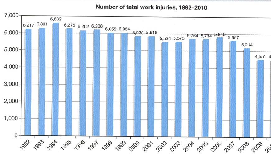
The bar chart offers detailed information about the number of people who had died in injuries at work in New Zealand between dates 1992 and 2010.
Overall, the difference in total fatalities each year was not significant. The lowest number of deaths occurred in 2009 with 4,551 fatalities in total; this had been in contrast to 1994 which had the highest total at 6,632.
However there were no clear or significant trends as the total numbers mainly fluctueted across the 18 year period. There were two minimal peaks in the totals firstly in 1994 and then again 2006, where the number of deaths reached 5,840. Lowest points were in 2002 where the numbers dipped to 5,534 and then 2008 where they dropped to 5,214. They reduced further in 2009 but then rose slightly to finish at 4,690.
Overall numbers of fatalities fluctueted though there is a minimal increase in the final year. (157 words)
Grade: 7
The information is presented well. It is ordered properly and a good level of detail is included. Assertions are backed up with some facts and numbers. Some key words have spelling errors; there are a few incorrect verb forms.